
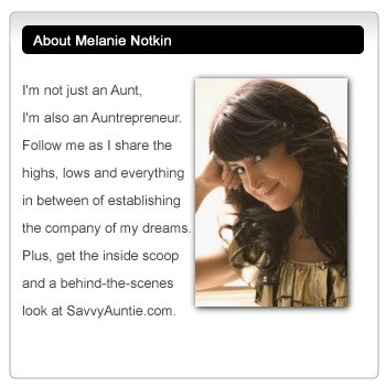
Dear Readers,
A Rose is a Rose, But it Ain't Pink.
Color is a very important component of a brand. It can be a differentiator: Coke is red, Pepsi is blue. It can be a uniter: Green means healthy and or, well "green." Color can be natural (brown) or unnatural (blue raspberry). Colors can be corporate (blue and gray) or fun (yellow and orange). The colors of your brand should be meaningful, even if they are just meaningful to you.
Taking time to create a color palette that is reflective of your brand is essential, in my opinion, to the brand promise. Don't show me a rainbow, but then be conservative. Don't look rugged, but then sell me flowers. Finally, don't be all frou frou and expect me to take you seriously.
Of course, different colors may reflect your brand if used in a consistent way - especially if your brand IS color. A few years ago, when I worked at the world's largest beauty company, I was editor of the company magazine. The palette of each quarterly issue of the mag reflected the palette of that season's runway. (You'll notice that certain color palettes are "big" every season. And you'll find many of the same tones used in cosmetics, home furnishings and of course, fashion.) Since cosmetics and fashion are integrally linked, the color palette of the magazine was always right on. And further more, you could always guess the timing of a past issue just by the palette. The magazine even received a Color Award from Pantone - the authority on color. That's how important color is to me.
Color defines a brand like scent defines a spice. In the case of Savvy Auntie, the choice of color also had to be personal since Savvy Auntie is a reflection of me. But it also had to reflect every Savvy Auntie and the "Playful Luxury" branding we were going for. The color had to define the brand.
Luxury is often reflected with metallics (difficult to achieve online) and black. So we knew that black would be part of the palette to ground Savvy Auntie in it's own richness. But how would we color in Playfulness?
Often the best way to describe the type of color palette you want achieved is by expressing the experience one might feel when seeing it. I told the agency that I wanted the Savvy Auntie Community to feel like walking into a local The Container Store on the hottest day of the summer, feeling the fresh cool air as the doors open, and seeing a lot of white, with spots of organized color (i.e. the containers) throughout. I wanted open and airy, with gorgeous, playful, bright, delicious, color peeking around everywhere.
So, we had black/luxury, white/open and airy, and color yet to be defined. Colors that resonate with me the most are warm tones with a shade of coolness and cool tones with a warmer side. This means blue reds, reddish pinks, and warm blue tones like teal.
I loved the pinks and reddish pinks I was shown. They were perfect, not too girly, not too grandmother of the bride, and very 'empowered woman.' These colors would be primary. The whites we chose had to be clean, but not cold. And black was black, unless it was just a shade under to give it more warmth and texture.
We threw in a few other colors, to empower the primary tones, and then played around with the colors as the site was being further developed. (We ended up added a fresh citrus green for a light punch of color and used less of the golden yellow tone that looked like gold gone soft)
What you see above is the color palette that defines Savvy Auntie and our Playful Luxury branding. Some colors are repeated in near similar shades, reflecting the ratio of use.
The Savvy Auntie flower, currently resting on our holding page at www.savvyauntie.com, along with the Nomination for Beta pages that follow it, are a perfect reflection of our color palette.
If the company name is the 'identity,' it's brand the 'promise,' then the color pallete is the world it all lives in. Savvy Auntie is my name, my brand is my promise, and I warmly welcome you to my world.
I hope when the site launches, you will feel right at home. Or at least, love the decor.
XOXO,
Auntie Melanie


Oh, WOW...LOVE the color scheme. Fresh, original, gorgeous!
ReplyDelete